Building from Brand to Experience
Every journey starts with a first step. For TallyUP!, that meant answering some big foundational questions. I led the team through brand discussions and explorations: What should TallyUP! stand for? What kind of emotional experience should it deliver? How will we stand out for our audience? How will the product scale?
Those early conversations shaped our entire design direction. I translated the outcomes into design principles that guided both the UX and visual identity. My goal was to design a simple, intuitive experience that would evoke the energy of classic game shows while feeling fresh and modern. Bold colors, animated screens, and fun win moments would create an immersive experience, blending nostalgia contemporary style... but never competing for a user's attention.
A vibrant yet minimal visual style blending nostalgia with modern design, built to engage players instantly.
UX Strategy for a Global Audience
Research & Understanding Audience
We knew TallyUP! had to be intuitive enough for anyone, anywhere to pick up and play with a limited learning curve. Before designing, I spent time collaborating with the team to understand our audience and product landscape. Through competitive analysis, stakeholder discussions, and early interviews, we identified an opportunity to attract both casual gamers and non-gamers motivated by real-world rewards. This foundational research helped define our UX priorities: simplicity, excitement, and clarity.


Examples from competitive analysis
User Personas
I then did a deeper dive into these user personas. Experienced players were familiar with mobile game patterns and expected fast-paced, engaging experiences. On the other hand, non-gamers were drawn in by the casual game show appeal and prizes, but needed clearer guidance and onboarding. I created specific personas for both groups, highlighting their goals, behaviors, expectations, and pain points—making sure every design decision was approachable for both ends of the spectrum.
User Flows
With personas in mind, I sketched out the full user flow for each new feature. The first phase comes through whiteboarding and flowcharts, which I reviewed with the team. Working these flows out in this way helped us spot dead ends, reveal gaps, and identify the user's decision points early on. It was an easy way to get everyone on the same page before diving into design.
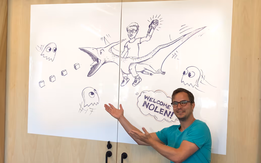
(Oh, and occasionally I would need to have some unexpected fun with the whiteboard, too 👀...)
Designing in Low-Fidelity
I always start with low-fidelity sketches and wireframes to quickly explore ideas and validate flow before committing to detailed visual design. This allows for fast iteration and early alignment across the team, minimizing confusion and ensuring we solved the right problems before transitioning into more polished mockups.
Prototyping
I create interactive prototypes and animatics for every major feature. These allowed the entire team—from engineers to stakeholders—to evaluate functionality, pinpoint issues early, and align quickly on final implementations. The prototypes became an essential tool for communication, iteration, and decision-making, helping us implement quickly with confidence.
Polished Mockups
Once we were aligned on these early phases, I brought the designs to life through high-fidelity mockups that captured the full visual language of the brand. Every screen was crafted to balance excitement and intuitive use. I always aim to bring in our bold color palette, motion, and game show-inspired UI elements. I worked closely with engineering to ensure each design was both beautiful and buildable. The result was a polished interface that felt intuitive, delightful, and distinctly ownable.
User research, clear design process, and rapid prototyping ensured team alignment and helped create a globally accessible user experience.
Scalable Design System
In parallel, I designed and maintained a scalable design system to ensure visual and functional consistency across the product. This included core color palette, typography, spacing system, and reusable components like buttons, form fields, modals, navigation, icon sets, and more. This not only accelerated production but also reduced development friction and enabled faster iteration, leading to successful, polished launches under tight timelines.
Power to the People: Testing and Validating
But designing and building the application is only one part of the puzzle. Getting user feedback is absolutely essential to ensure that what we think is the right decision is actually going to be successful. I led video user testing sessions to evaluate functionality and identify pain points, then utilized findings to direct UX improvements. Sometimes we were right, and sometimes we were way off. One major insight came from the onboarding experience. I led a full UX audit and redesign that simplified the flow, clarified messaging, and aligned better with user expectations, resulting in a nearly 20% boost in first week user retention.
Beyond UX
My role goes far beyond UX. I also lead the art direction, creation of game assets, characters, and animations that brought the TallyUP! world to life. From concept art to character designs to illustrations, I ensured everything felt playful, cohesive and aligned. In the end, this work has a huge intersection with UX...the way we present these games has a tangible impact on the player experience and retention. The result was fun and dynamic gameplay that felt polished, unique, and in our universe.
Additionally, I play a key leadership role in mentoring our design and art team and external vendors. I support their growth in design, creative problem-solving, and visual storytelling, emphasizing both craft and critical thinking. I firmly believe that investing in team members is an investment in the product itself. As we collectively build skills, the end experience becomes stronger for the user. So I dedicate time to regular feedback sessions and hands-on collaboration, offering encouragement along with constructive feedback that pushes growth and elevates the work.
Design That Grows With the Product
As new features rolled out, I simultaneously refined our scalable design system, ensuring we could iterate rapidly without sacrificing consistency. This living system unified TallyUP!’s visual language and interaction patterns across the app, website, marketing, and beyond, creating a seamless brand experience at every touchpoint. By creating a solid but flexible design foundation, we not only accelerated development but also maintained design quality as the product evolved. This iterative approach allowed us to respond quickly to user feedback and shifting needs, driving improvements that directly contributed to TallyUP!’s ongoing success.


